3D website · Mannequin somersault
Centro Slancio
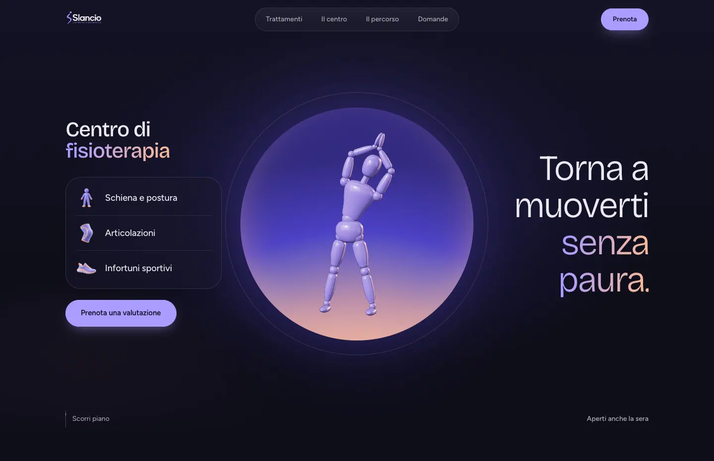
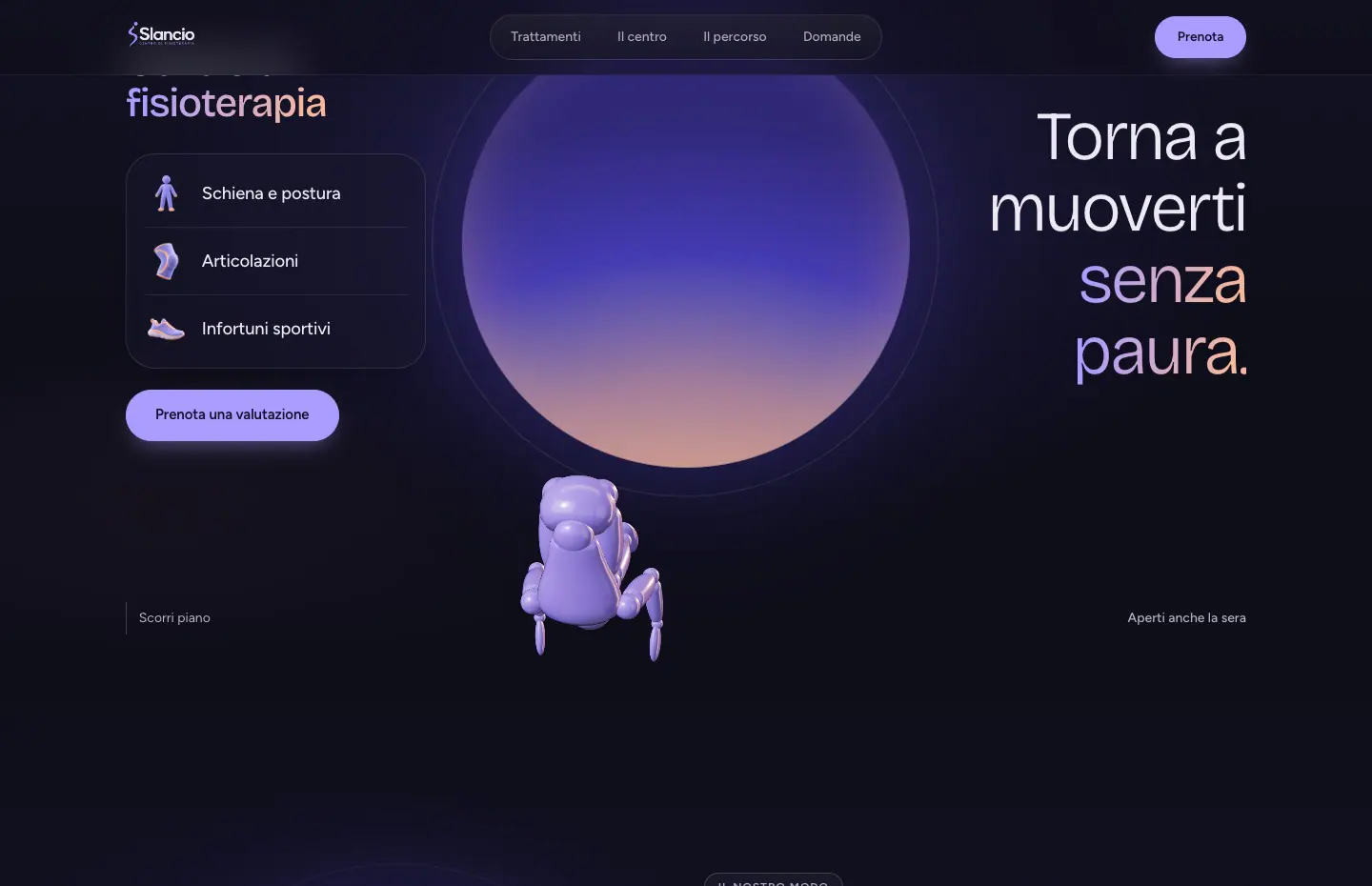
A lavender mannequin somersaults towards you, then gets back up without hurrying.
- Year
- 2026
- Status
- Concept
The problem
Anyone with back pain or recovering from an injury is mostly looking for someone to trust.
Yet physiotherapy websites tend to look alike, with a list of treatments full of technical names, stock photos and a phone number. They rarely explain how the first visit works, how many sessions to expect or who will be treating you, so people who are already afraid to move end up with more doubts than before.
The solution
I imagined Centro Slancio as a place where you get moving again without rushing.
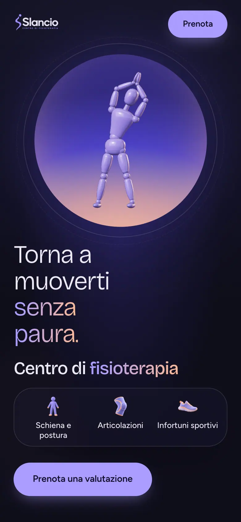
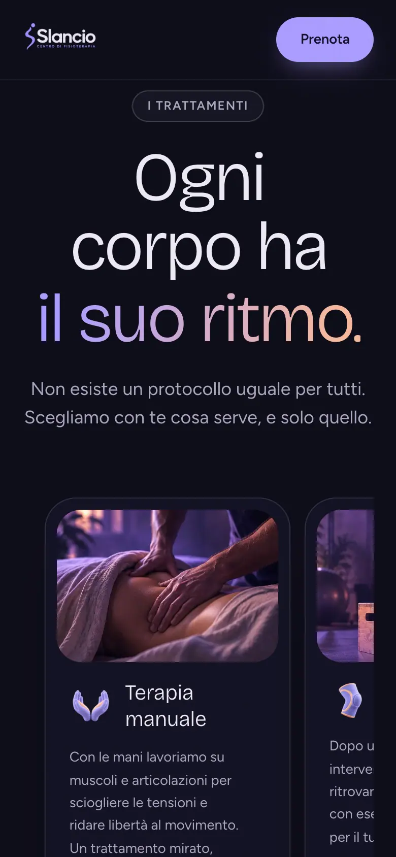
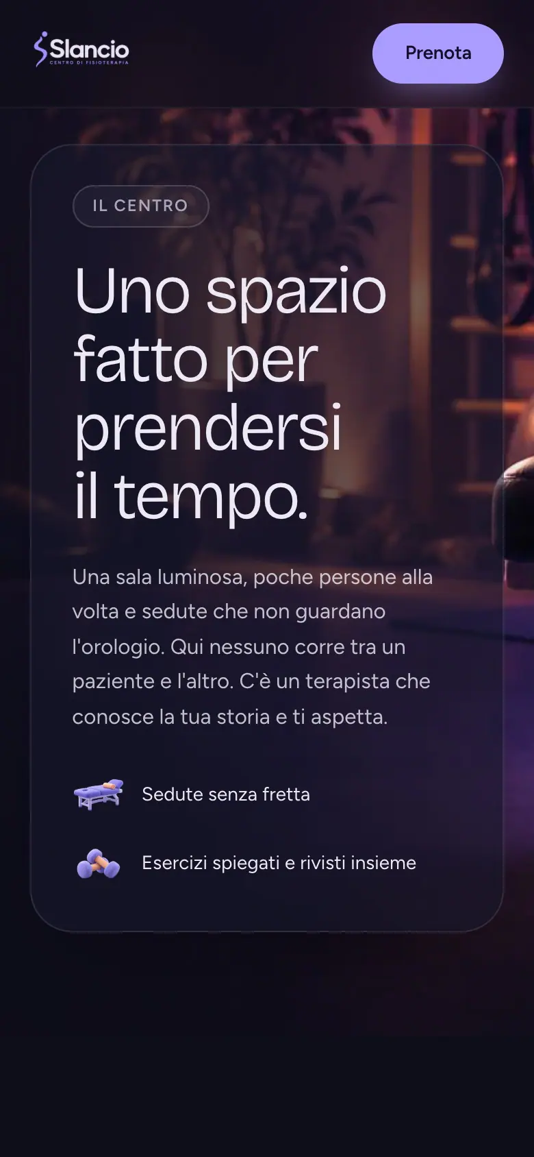
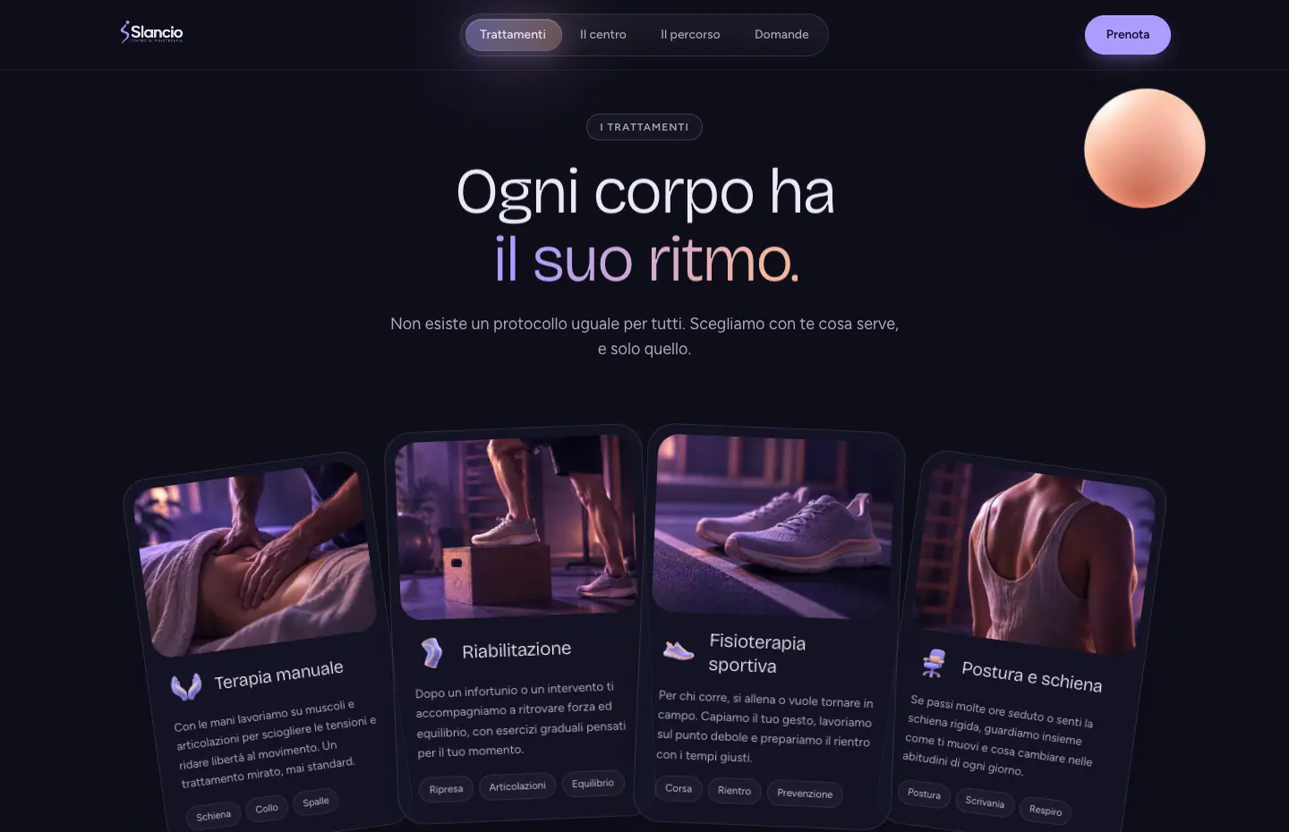
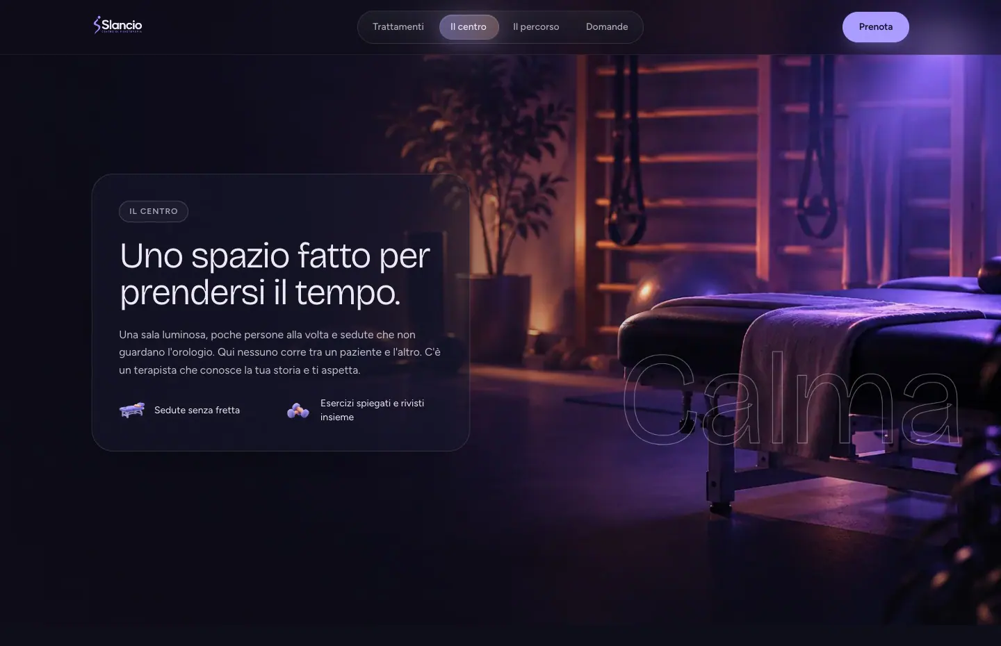
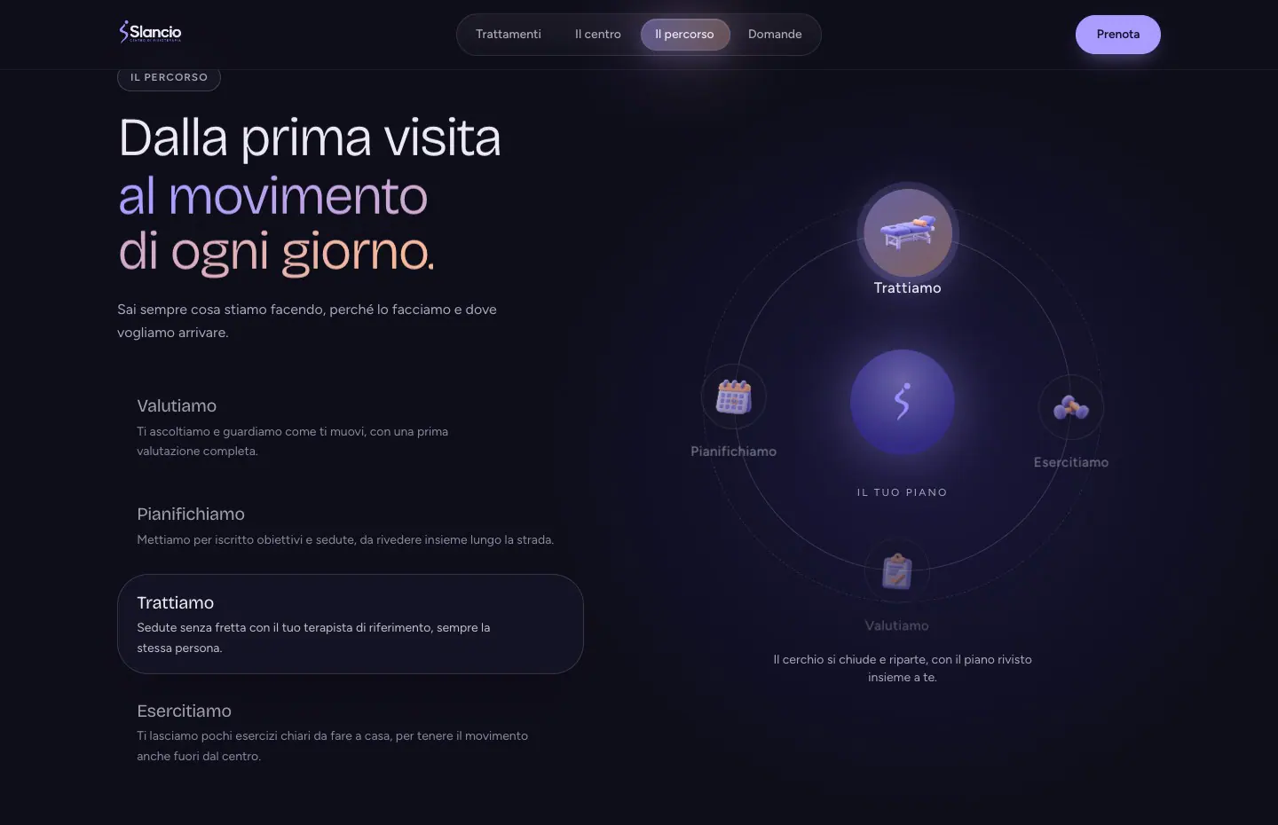
At the top, a jointed lavender mannequin, built in code so that every joint can really bend, holds a side stretch inside a large disc fading from indigo to peach. As you scroll it crouches, puts its hands down and somersaults towards you, then lands in the disc of the next section and stands back up. Next come the treatments, four cards that fan out, the centre's room drawing closer until you step inside, the care path with its stages circling the brand symbol, the questions and the form to book a first assessment. I chose a very dark indigo background, lavender as the lead colour and light, soft headings.
The site in numbers
- Joints in the mannequin that bend during the somersault
- 15
- Treatments on cards that fan out
- 4
- Sections, from the stretch to the booking
- 7
Technologies
- React
- Three.js
- GSAP
- TypeScript
- Tailwind CSS
- Vite
- Lenis
- Motion
- 21st.dev
- ChatGPT
The screens
On mobile
The same site on a phone, designed for thumbs and small screens.
1 of 3
Use the left and right arrow keys to browse the screens.
On desktop
The page scrolls and the scene changes with you. Here are a few moments, from the opening to the contact section.
1 of 5
Use the left and right arrow keys to browse the screens.