
3D website and shop · Inside the hoodie
Garzato
Scroll, a squeegee prints the logo, then pick a hoodie and try it on your own photo.
- Year
- 2026
- Status
- Concept
The problem
Anyone buying sweatshirts and T-shirts online finds almost the same shop every time, with photos on a white background, a size chart and a cart.
You cannot tell whether the cotton is heavy, how the seams are finished or whether the print will survive the wash, which is exactly what sets a well-made garment apart, and you only find out how it fits when you open the parcel. For a small workshop that cuts, sews and prints by hand, a site like that hides the very craft it lives on.
The solution
Garzato is a workshop that invites you to look at a sweatshirt inside out, and the site is also its shop.
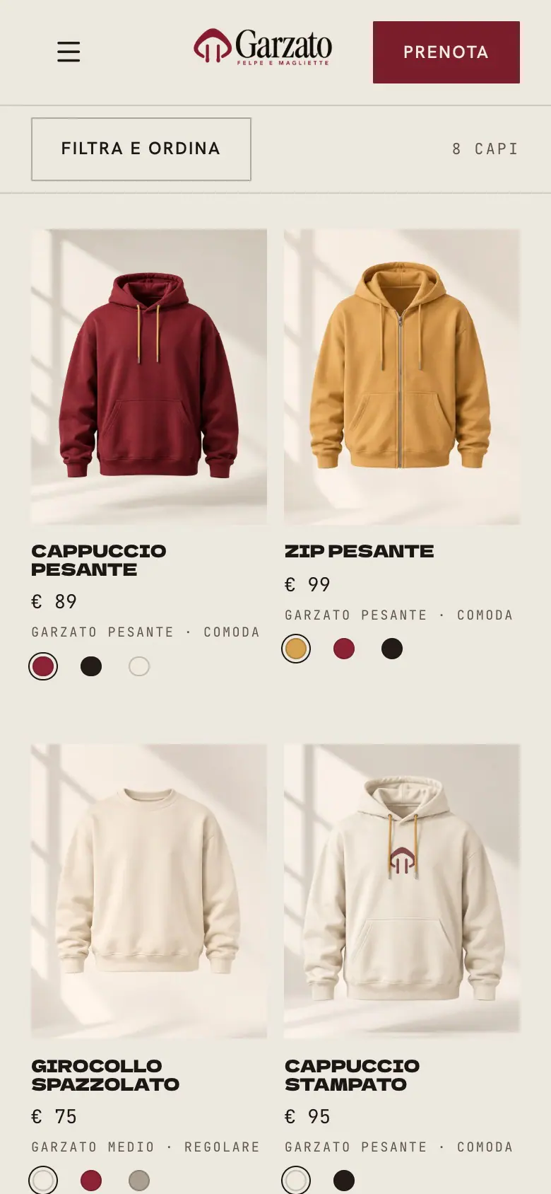
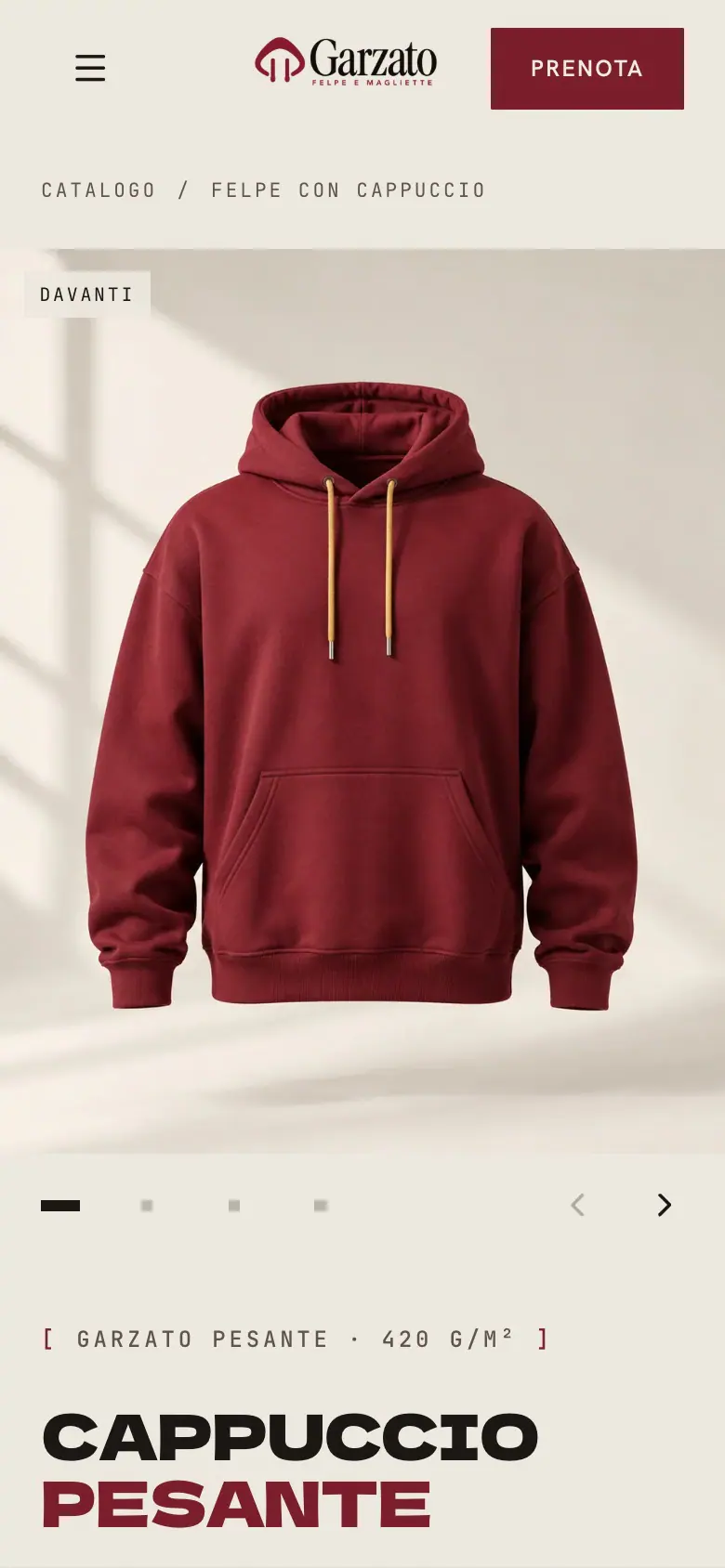
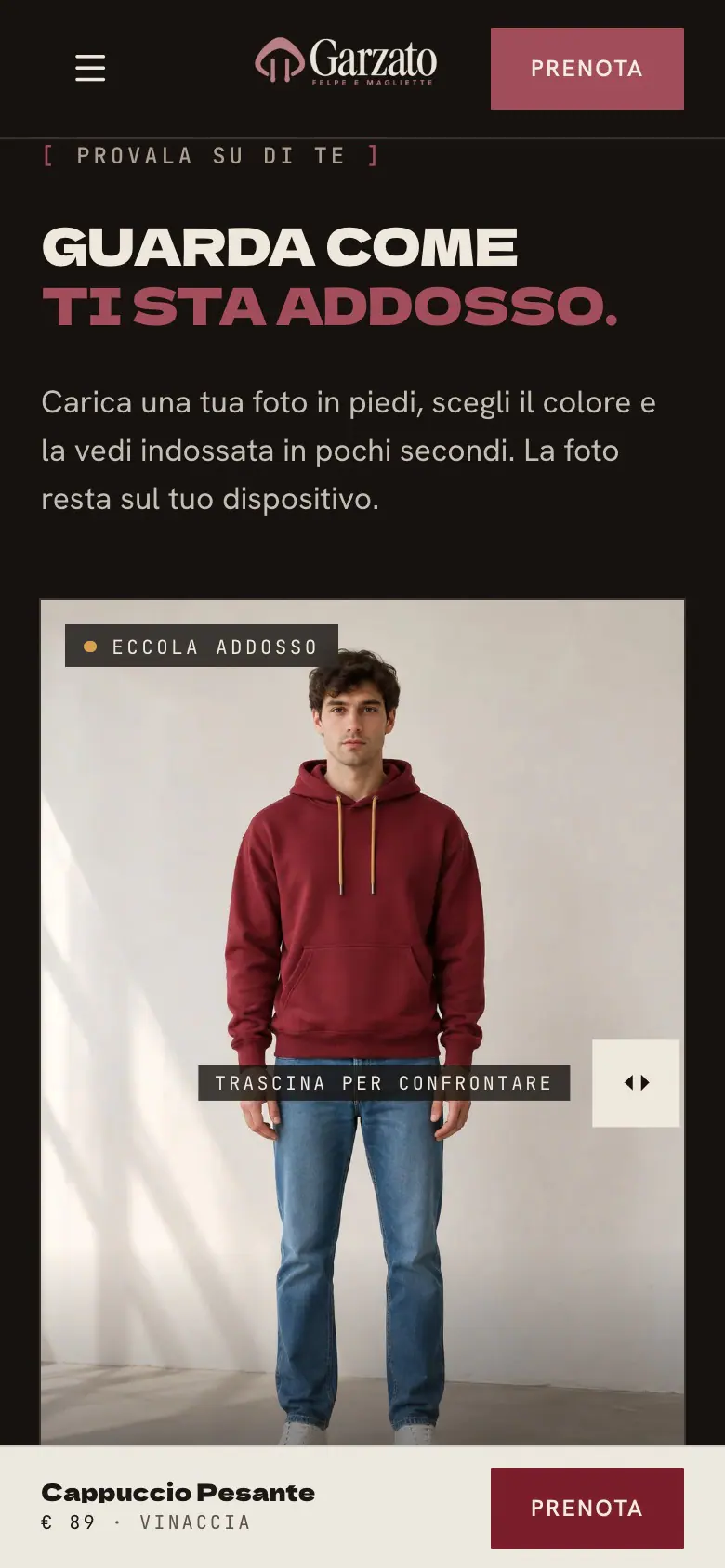
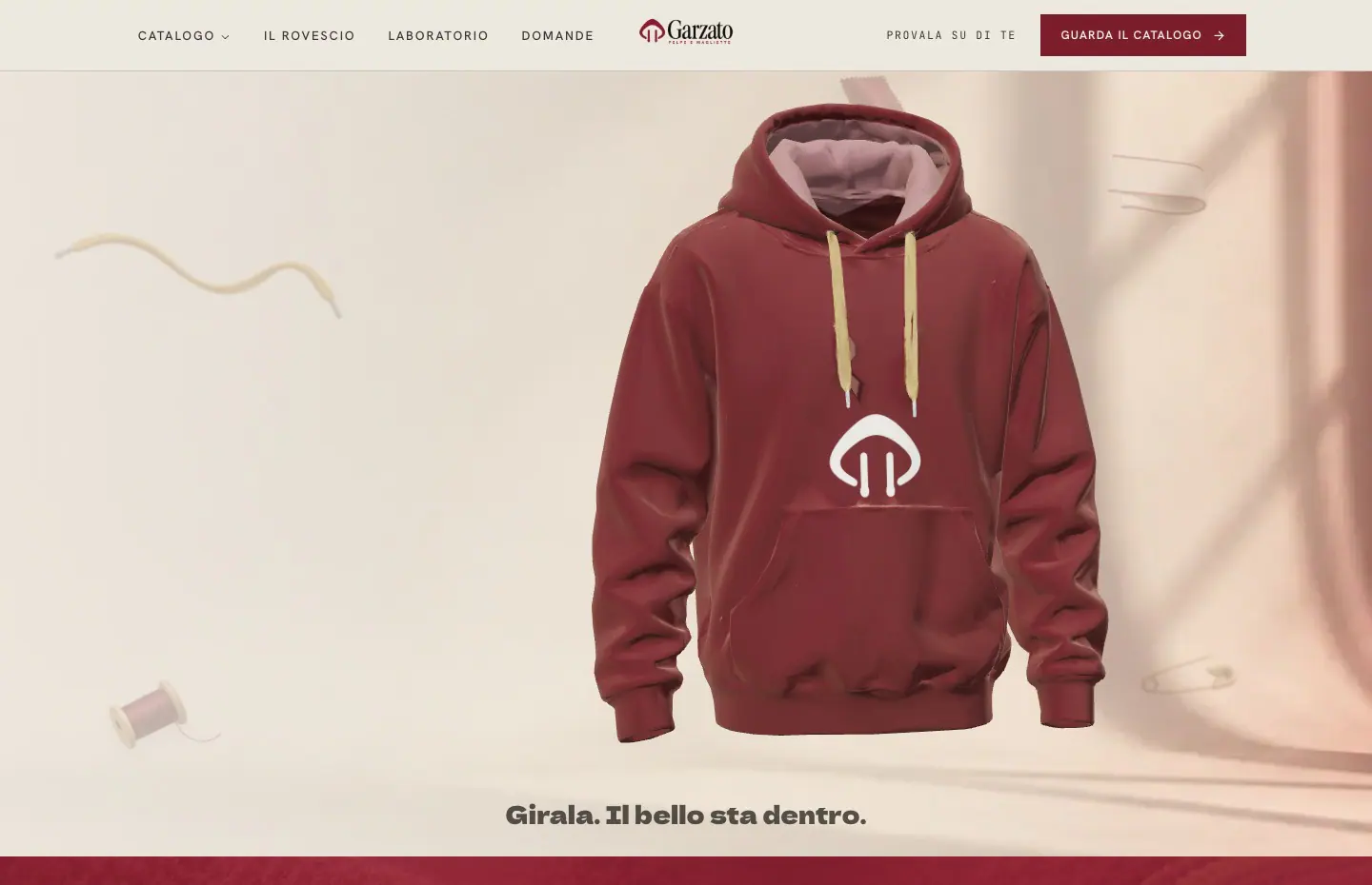
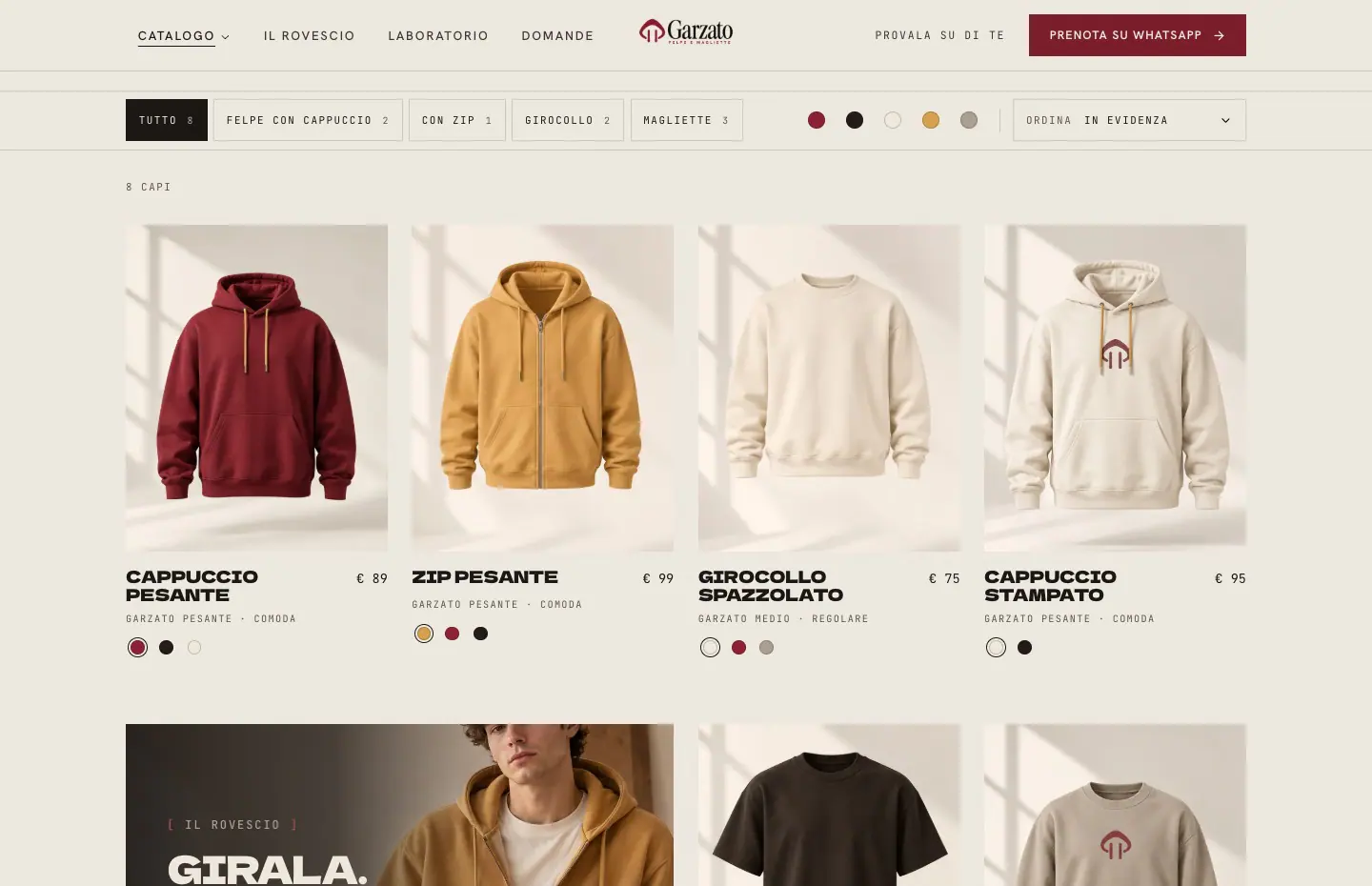
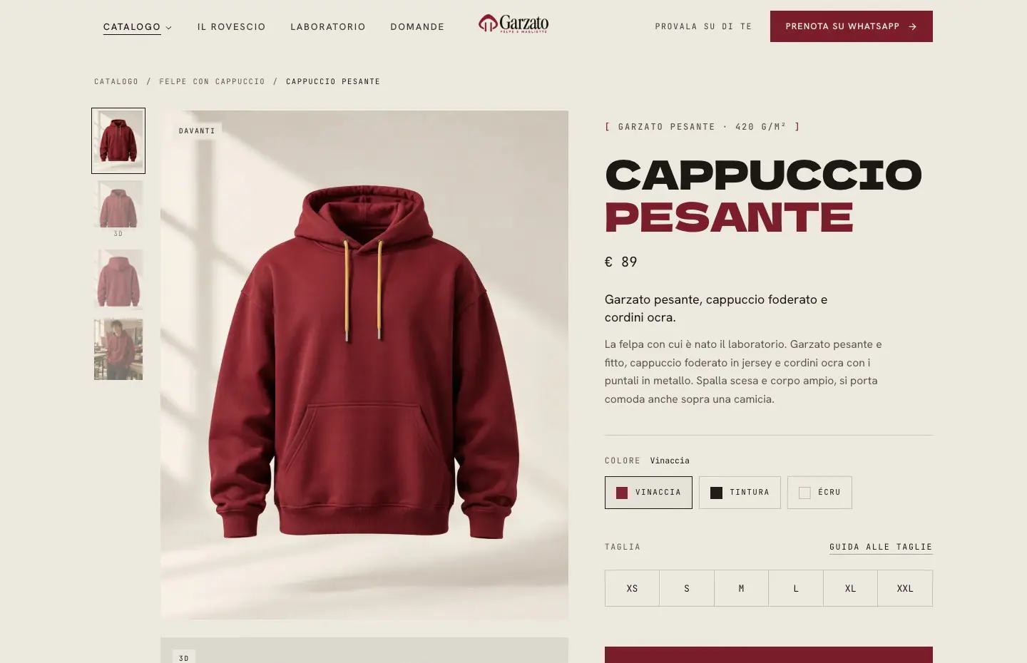
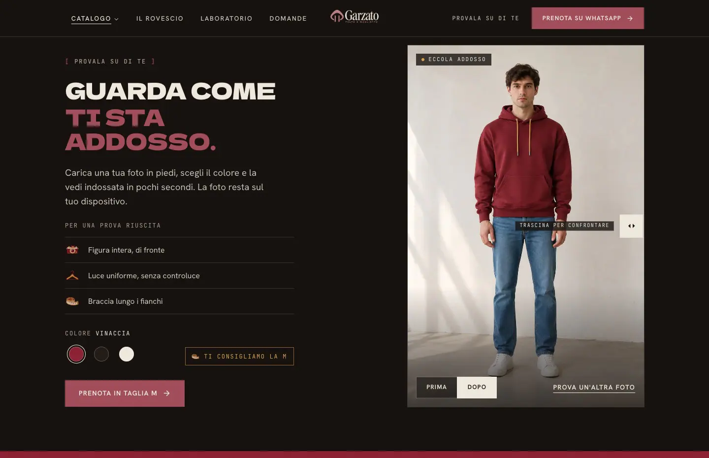
At the top the burgundy hoodie, a generated and refined 3D model, floats next to a big uppercase headline. As you scroll the scene holds still, the hoodie turns to face you and a squeegee sweeps across the chest, leaving the logo printed on it, then you slip in through the neck and land on the soft brushed fleece. In the catalogue you filter by type and colour, the cards rearrange with a smooth motion and show the back of the garment on hover. On the product page you turn the 3D hoodie by dragging it and it changes colour with the swatches, sizes come with their own guide and you book on WhatsApp with the message already written, with no cart. Further down there is the photo try-on. You upload a full-length photo, an ochre line measures shoulders and hips, the squeegee prints the hoodie onto the photo and you drag to compare before and after. For now the result is a ready-made sample photo, while the interface is complete and can be connected to a virtual try-on service. I kept burgundy with ochre on a cotton-coloured background, with heavy uppercase headlines.
The site in numbers
- Pieces in the catalogue, each in two or three colours
- 8
- Linked pages, from the storefront to the product page
- 3
- Sizes from XS to XXL, with a size guide
- 6
Technologies
- React
- Three.js
- GLSL
- GSAP
- TypeScript
- Tailwind CSS
- Vite
- Lenis
- Motion
- 21st.dev
- Meshy
- ChatGPT
The screens
On mobile
The same site on a phone, designed for thumbs and small screens.
1 of 4

Use the left and right arrow keys to browse the screens.
On desktop
The page scrolls and the scene changes with you. Here are a few moments, from the opening to the contact section.
1 of 7



Use the left and right arrow keys to browse the screens.